Renaissance Entrepreneurship Center
Renaissance Entrepreneurship Center
More jobs are created through small business than by medium-sized or large corporations. Renaissance Entrepreneurship Center has been empowering and supporting local socially and economically diverse small business entrepreneurs since 1985. From four Bay Area locations they provide a wide range of start-up, incubation and business support services and have helped entrepreneurs launch thousands of businesses.
Kollar Design was engaged to redesign the Renaissance logo and establish a new visual branding system. The leadership, staff and the Board of Directors felt a deep emotional attachment to a poorly-designed, outdated logo. This is not unusual. Though the design was contrived, it had come to represent everything the organization meant to them, as logos tend to do. Besides the logo itself, there was another serious branding issue that needed to be addressed that they weren’t even aware of. If they were ever to grow regionally, their name was going to present problems down the road.
At the time they were well known as San Francisco Renaissance Entrepreneurship Training Program. There was a strong affinity for being a San Francisco organization and being known as such. Though it was a difficult decision for them, they found the courage to heed our advice. We dropped “San Francisco” and revised the name to become, simply, Renaissance Entrepreneurship Center. Read on to see why this change was so important to their growth and the power of their brand.
A design success story
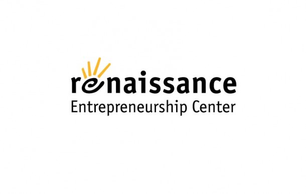
The logo designed by the Kollar team for Renaissance, with its iconic symbol embedded in the logotype, was recognized with an award of excellence by American Corporate Identity. The spiral in the symbol represents creation and growth – the process of becoming – and the fingers or rays represent reaching out to the community. Together the spiral and rays form the image of a hand which speaks to touching people’s lives, which is what Renaissance does many times every day.
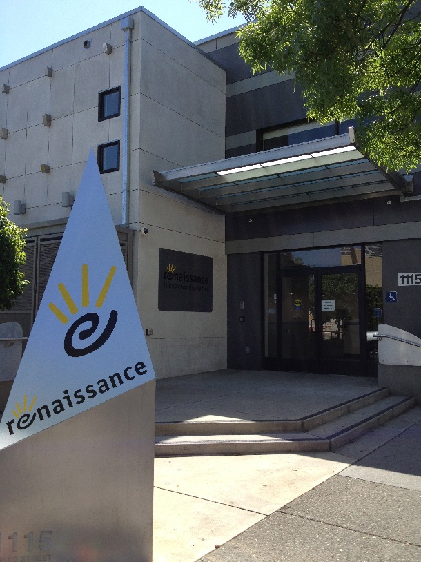
When it came time to roll out the reinvented brand identity we worked with Renaissance to create the critical first applications that included new stationery, print materials, and interior and exterior building signage.
Renaissance has grown by leaps and bounds under their reinvented identity. They now have branch centers located all around the Bay Area. Included in the click-through gallery above is a recent example of the symbol applied to an exterior signage kiosk at Renaissance Marin in San Rafael, which opened in 2012. We believe you will agree that, even after more than 10 years, the designs we delivered still stand up well today.
Addendum
We have been inspired by the Renaissance spirit, vision and leadership, and the huge positive impact they have had on scores of Bay Area small business entrepreneurs including ourselves. Kollar Design was incubated and “hatched” from the Renaissance business incubator in 2001. We are grateful to Renaissance for the support they have provided to us over the years. Should you be inclined to support worthy organizations, look no further. Or, if you are contemplating launching your own small enterprise, check them out. You will find a terrific resource and community. http://www.rencenter.org/


